This web browser is not supported. Use Chrome, Edge, Safari, or Firefox for best results.
XWord Info Home
| Previous | Next | Author pages: John Lieb Andrea Yañes both | Aug 2018 grids | Solve & Print | PDF | FAQ | Pay
New York Times, Tuesday, August 21, 2018
1-Down : Include covertly in an email
This puzzle:
Rows: 15, Columns: 15 Words: 76, Blocks: 36 Missing: {FQVXZ} This is puzzle # 14 for Mr. Lieb. This is the debut puzzle for Ms. Yañes. Tuesday freshness: 93%
Support XWord Info today
Pay now and get access for a year.
Constructor notes:
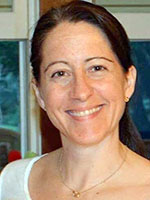
ANDREA: As I'm sure is true of many constructors, I'm thrilled to have a puzzle published in the Times for the first time. It'll be a ... read more
Jeff Chen notes:
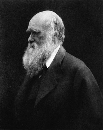
D "evolving" to DARWIN, what a fun idea! I usually think of "evolving" as one element changing for the better, so my first thought as ... read more
1 B | 2 I | 3 G | 4 A | 5 P | 6 E | 7 C | 8 N | 9 N | 10 A | 11 P | 12 P | 13 T |
||
14 C | R | A | N | I | A | 15 A | C | A | 16 T | E | R | I |
||
17 C | O | P | T | E | R | 18 P | A | R | 19 T | H | R | E | E |
|
20 N | Y | E | 21 T | 22 E | N | A | C | I | O | U | S | D |
||
23 O | M | E | 24 K | A | T | 25 A | S | S | A | Y |
||||
26 D | A | A | 27 L | I | G | S | 28 H | 29 O | 30 W | 31 A | L | E |
||
32 E | N | R | O | N | 33 A | R | M | 34 H | 35 O | L | E | S |
||
36 S | T | 37 E | 38 E | L | Y | D | A | N | ||||||
39 C | 40 A | 41 S | S | E | T | T | E | 42 S | T | 43 A | 44 B | 45 S |
||
46 O | R | E | 47 D | A | R | 48 N | 49 T | O | O | T | I | N |
||
50 M | E | A | 51 T | 52 S | 53 M | I | N | 54 E | R | L |
||||
55 B | O | B | B | Y | 56 D | 57 A | 58 R | I | N | 59 I | C | Y | ||
60 A | L | L | A | L | O | N | E | 61 G | 62 O | G | R | A | 63 Y |
|
64 T | A | U | R | 65 J | O | N | 66 O | N | E | O | N | E |
||
67 S | E | E | S | 68 O | N | O | 69 D | A | R | W | I | N |
© 2018, The New York Times8/21/18 ( No. 25,123 )
Across
1
Galoot : BIGAPE
7
"State of the Union" channel : CNN
10
Datebook entry: Abbr. : APPT
14
Skulls : CRANIA
15
Obama health measure, in brief : ACA
16
Actress Garr : TERI
17
"M*A*S*H" transport, informally : COPTER
18
Augusta National's infamous 12th hole, for one : PARTHREE
20
Bill ___, the Science Guy : NYE
21
Comedy rock duo featuring actor Jack Black : TENACIOUSD
23
Queen Gertrude's "alas" in "Hamlet" : OME
24
Kit ___ (candy bar) : KAT
25
Test, as 46-Across : ASSAY
26
Sacha Baron Cohen program of the early 2000s : DAALIGSHOW
31
Hoppy brew : ALE
32
Infamous bankruptcy declarer of 2001 : ENRON
33
Vest openings : ARMHOLES
36
"Reelin' in the Years" band : STEELYDAN
39
Part of VCR : CASSETTE
42
Attempts : STABS
46
Material that is 25-Acrossed : ORE
47
"Abso-lutely!" : DARNTOOTIN
50
Deli selections : MEATS
53
Opposite of max. : MIN
54
Schubert's "The ___ King" : ERL
55
1950s-'60s teen idol who sang "Dream Lover" and "Splish Splash" : BOBBYDARIN
59
Quite standoffish : ICY
60
Enjoying some me time, say : ALLALONE
61
Embrace the aging process, in a way : GOGRAY
64
Bull: Prefix : TAUR
65
Garfield's owner, in the funnies : JON
66
New Year's Day : ONEONE
67
Comprehends : SEES
68
Lennon's love : ONO
69
Evolution theorist ... or what the circled letters are evolving toward? : DARWIN
Down
1
Include covertly in an email : BCC
2
Avenger in a red-and-gold suit : IRONMAN
3
Hiatus between high school and college : GAPYEAR
4
Pot starter : ANTE
5
Slapstick projectile : PIE
6
Wildlife identifier : EARTAG
7
Quaker Oats' ___ Crunch : CAPN
8
March Madness org. : NCAA
9
Deal breaker? : NARC
10
Fellow Musketeer of Aramis and Porthos : ATHOS
11
Casual reading : PERUSAL
12
Chance to get good seats, say : PRESALE
13
Colors 1960s-style : TIEDYES
19
Spanish aunt : TIA
22
U.F.O. crew : ETS
23
Words of praise : ODE
24
"Roots" protagonist Kunta ___ : KINTE
27
An overtime one counts as a point in the N.H.L. : LOSS
28
More robust : HALER
29
Jazz's Kid ___ : ORY
30
Iraq War concern, for short : WMD
34
Is wearing : HASON
35
Aware of : ONTO
37
When something should take off, for short : ETD
38
Opposite of 37-Down : ETA
39
Fights against : COMBATS
40
Anatomical rings : AREOLAE
41
Ocean shade : SEABLUE
43
Was humbled : ATECROW
44
South Asian mixed rice dish : BIRYANI
45
Show with "TV Funhouse" pieces, in brief : SNL
48
Abbr. for someone with just a first and last name : NMI
49
Self-important minor official : TINGOD
51
Ski lift varieties : TBARS
52
Word part: Abbr. : SYL
56
Setting for "The Karate Kid" : DOJO
57
Shortly : ANON
58
Gambling mecca : RENO
59
Bob ___, longtime Disney C.E.O. : IGER
62
___ lark : ONA
63
Craving : YEN
Answer summary:
3 unique to this puzzle, 1 debuted here and reused later.
Found bugs or have suggestions? Please let us know.
Like this puzzle? Please share this page on social media to help spread the word about XWord Info. Thanks!


